Data Visualization with Tableau: 4 Best Case Studies to Know
Discovering the commercial benefits with data visualization.


Visualizing the information is more convenient than delving into the complex data table collections because the human brain easily digests the graphics, unlike the Excel spreadsheets due to their lack of information overload. That is why more and more people realize how to apply Tableau data visualization in the business context and discover the commercial benefits. In this article, you will find the examples of Tableau business cases with an ample outcome because of data visualization.
Impacting the businesses
Data visualization increases the revenue for enterprises. How, though? First of all, it allows to obtain the profound insights when answering the data-related questions: instead of trying to structure the messy information, one can easily observe trends in revenue, costs, customer count, conversion rates, and the other e-commerce metrics (MAU, DAU, CPC, CPA, LTV).
By visualizing the information, it’s easy to find inefficiencies, to determine seasonality and optimize the company’s strategy through development of profitable directions. Also, visualizing the data is the way of guaranteeing the objective source of truth for all levels of leadership and providing all of the departments with the up-to-date and truthful information. An example of efficient visual representation can be found down below:
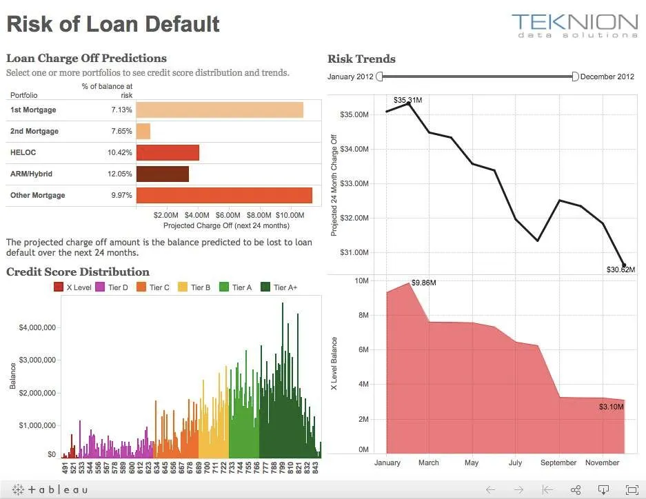
Source: Tableau Online
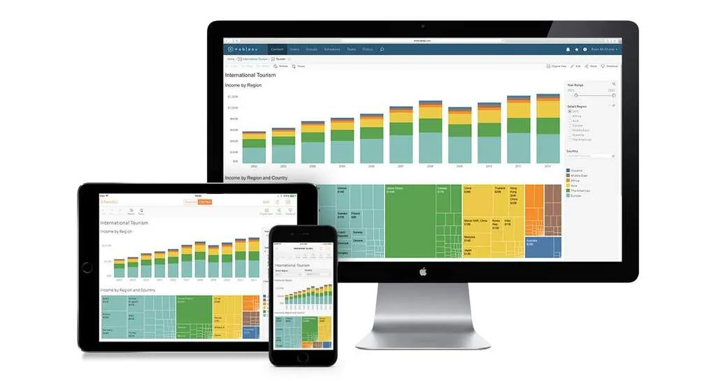
Tableau, a suitable solution
Tableau is a good choice for the users in need of cross-platform reports (on tablets, smartphones, or desktops). Tableau is easy to use and is suitable for sharing the data with all the members of the company. At the same time, it is convenient for processing the large sets of information, regardless of the amount of sources.
In fact, Tableau leverages an extensive set of data connectors, such as MySQL, Google Analytics, Google SpreadSheets, Excel, CSV files, and others. Thus, it provides the users with advanced analytical dashboard capabilities along with assisted formula editing, forecasting, clustering, and flexible deployment options (in-cloud, on-premises, and online).
Source: Tableau Online
Coca-Cola: shaping the essence of analytics
Coca-Cola, the largest beverage company in the world, looked how to replace its daily 45-minute manual data reporting process. Previously, the team spent a considerable amount of time trying to connect over 200 million lines of data from over 100 different systems into single storage to then build one usable dashboard. To boost the efficiency and carry out a real-time data, Coca-Cola adopted Tableau. Because Tableau consolidates the data from multiple sources, various teams at Coca-Cola can now actively comprehend the metrics, including the budget, delivery operations, and profitability in a matter of few clicks. Simultaneously, the sales department can now access the data from the remote locations by using the iPads, which increased overall timeliness. Finally, the executive reports automatically refresh each day at 5:45 am, unlike the previous times.

Coca-Cola Tableau case study
Lenovo: a 95% increase in efficiency across the company
Lenovo, a global technology company, aimed to optimize its analytics experience across all the departments and worldwide offices. Previously, Lenovo operated with one single sales report that was delivered to 28 different countries. When different regions or company’s divisions wanted to adopt the report to extract the most valuable data, it required a commitment of eight to ten individuals and led to a massive number of on-hold tasks for the analytics team. In turn, Lenovo decided to use Tableau to orderly structure the data all across the company. As a result, Lenovo got a flexible dashboard with all the sales that can be adapted for the ad-hoc analyses, which also led to 95% efficiency improvement across 28 countries. With the help of Tableau dashboard ideas, Lenovo gathered the engagement metric, thus crafting a better experience and collecting more revenue.

Lenovo Tableau case study
LinkedIn: empowering 90% of the Sales Team
LinkedIn, a largest professional networking website, wanted to synchronize all the data across its internal databases (Google Analytics, Salesforce.com, third-party tools). Previously, one analyst at LinkedIn would handle daily sales request from over 500 salespersons, which created a reporting queue of up to 6 months. To fix the issue, LinkedIn decided to use Tableau to centralize the spread out data and develop a series of customer access dashboards. As a result, thousands of individuals nowadays can access the Tableau Server on a weekly basis, which constitutes 90% of the LinkedIn sales force. With the interactive real time dashboards in Tableau, one can easily predict churn and track the current performance, which eventually created more revenue through the proactive cycle of sales.

LinkedIn Tableau case study
Bookimed: Building real-time analytical dashboards
Bookimed, a Ukrainian service for searching the best medical solutions worldwide, wanted to make an x2 increase in revenue by year. To do so, the companies that use Tableau would have to make reasonable decisions based on data. We understood that previously managers had issues with evaluating hypothesis and tasks prioritization because of the manual filtering through the information. Usual data analysis required next steps:
- Making a task for IT-department to load raw data in CSV file.
- Filtering this data by hand and exploring it to Excel.
- Manually linking data from Excel, CSV files to data from Google Analytics and Google AdWords.
In order to get quick and error-free insights from data and tracking the real-time state of the business, Bookimed decided to use Tableau and Tableau Online services. The main goal was to create the customizable for every department real-time dashboard system. To fulfill these tasks, we did undergo three steps:
- Connected Google Analytics, Google Adwords and MySQL to Tableau.
- Set-up Dashboards for every department at Bookimed.
- Additionally, data root labs incorporated Amazon Redshift + Amazon Kinesis for advanced data gathering and more sophisticated data analysis.
Here are some of the first graphics of the company (numbers are random and for visualization purpose only):
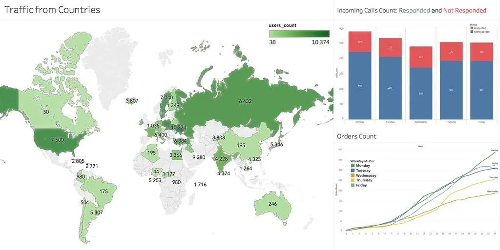
Graphics and Visualizations (Tableau). Source: Bookimed.com
Outcome
Now, Bookimed.com has the system that delivers all the relevant data and information to every member of the company in real-time mode. Simultaneously, Bookimed got all of the following:
- Reduced the business analysis time from 1 week to 2 hours and ensured the data-driven decision making among employees.
- Build based on data reasonable growth plan for increasing the revenue by 10% monthly.
- Acquired the data visualization infrastructure that can be easily modified, scaled, and changed according to the business needs.
Other Industries where Tableau is used
Healthcare Analytics
- BJC, a company that provides healthcare to residents of Missouri and Illinois, reduced supply chain expenses from 23.5% to 19%.
- Seattle Children’s, a pediatric hospital, saved more than 40000 clinical hours each year and $100000 with demand flow.
Education Analytics
- Des Moines Public School District received an ability to quickly detect high-school students with the likelihood to drop-out.
- The University of Notre Dame got able to perform data analysis using Tableau 10x times faster.
Government Analytics
- The city of Tallahassee measured workload sewers’ efficiency and made utility decisions that improved productivity by 30%.
- Surrey County Council reduced analysis time from days to hours to track intervention at youth clubs.
Marketing Analytics
- Allrecipes, a largest digital food brand, increased the mobile site visits from 8 percent to more than three-fourth of total.
- PepsiCo cut analysts time by 90%.
Tableau Insurance Analytics
- EY, a professional risk management organization, saved clients millions of dollars and prevented fraud.
- MA Assist, the UK-based property services firm, cut insurance claim duration by 15% and improved business efficiency by 20%.
High Technology Tableau Analytics Examples
- GoDaddy, an international web hosting firm, scaled 13TB of data governance and and optimized product experience for over 17 million customers.
- Ancestry.com, a largest online resource for searching family history, visualized billions of rows of data for strategic decision-making.
Have an idea? Let's discuss!

Talk to Yuliya. She will make sure that all is covered. Don't waste time on googling - get all answers from relevant expert in under one hour.
![AI in Logistics: Emerging Startups, Challenges and Use Cases [UPDATED 2024]](https://drl.fra1.digitaloceanspaces.com/drl-prod/images/origin/ai_in_logistics_emerging_startups_2024_71afef795f.webp?fit=x1200,x800,x400,x256/width=2400)

Author
Co-Authors